What do you use for your Facebook Timeline Cover Image?
It’s seems to be one of those controversial questions that doesn’t seem to have the right answer.
But if you if you ask me, it is not as trivial as the age-old question of over-the-top or under:
Generally speaking, you will see many churches use the prime real estate on their Facebook page as the place to feature one of three categories of images.
WHAT DOES YOUR FACEBOOK TIMELINE COVER IMAGE SAY TO A VISITOR?
Now assuming that your objective with messaging, especially on social platforms, is to be externally focused, hoping to invite new visitors to visit your church for the first time, my question is what does that cover image communicate?
Does it accomplish the objective?
In the age of digital distraction, we say the general rule for any given webpage is that you have eight seconds before the visitor will abandon the page and try something else if they don’t find what they need.
On social media, scrolling reduces the time to capture one's attention down to a couple of secs. Share on XOn social media, scrolling reduces the window of time to capture someone’s attention down to just a couple of seconds.
#1 // “THIS IS OUR CHURCH” FACEBOOK TIMELINE COVER IMAGE STRATEGY
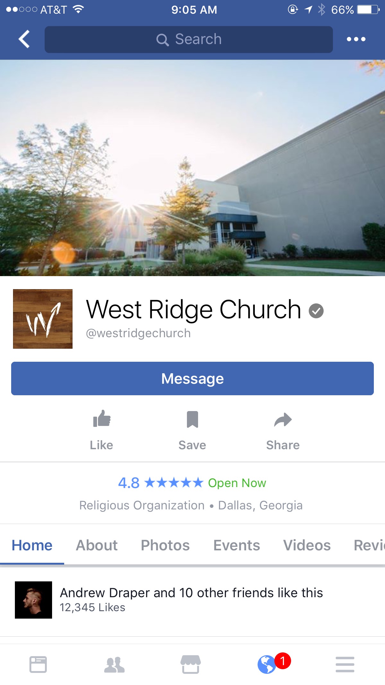
A standard use of the Facebook timeline cover image is to feature a photo of the church building, or the congregation, or the pastor.
If you were going to use this as your timeline cover image, I would suggest you make sure that you feature awesome photography. Do you want your building to look dynamic and contemporary. Not run down, decrepit, aging.
Here’s one example from West Ridge Church:
If you feature photos of your people, you might consider making sure that people are smiling and happy, include groups of people, not photos of one or two in larger empty spaces.
#2 // “WHAT’S PLAYING NOW” SERMON SERIES FACEBOOK TIMELINE COVER IMAGE STRATEGY
One strategy many churches use is to feature the same graphics they are using for the current sermon series.
There are many reasons to use the sermon series graphics strategy. Here are some:
- Consistency of messaging across all mediums helps fortify brand experience.
- The clear majority of the people visiting your Facebook page is probably current members and attendees. Letting them know which message Siri’s is being preached help them with any potential conversations they have with friends and family that they will invite this coming Sunday.
- From an internal workflow and logistics point of view, everyone has limited number of team members and band with each week. Practically speaking it is easier to repurpose series graphics that you are already producing versus creating a completely new creative request just for Facebook and social media.
- In a culture where “regular attendees” don’t actually attend all four Sundays of a given month, providing cues about the current series helps them feel connected and “in sync” with what’s going on even if they aren’t there this week.
- The message series are meant to hit upon broad based topics that the general public, and hence any given visitor, might, could, should be interested in. The intent is to give them a clue of what the church is talking about to demonstrate relevance and further the interest in visiting.
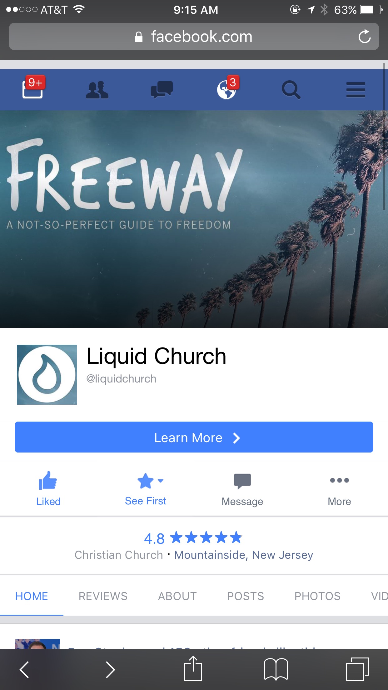
I’ll pick on Liquid Church for this example. Take a look of the cover image being used this week:
But for a little pushback, I’m wondering if a sermon series cover image like the one in the example actually achieves those objectives.
As an experiment, I showed this Facebook page to a couple of random people and asked them what they thought about Liquid Church here in Jersey.
Some interesting questions came out:
These are the exact type of questions that prompted me to say that sermon series graphics for Facebook timeline cover images probably is NOT the best choice – usually.
Do you see my point? Sermon series graphics seems easy. Seems right. But it really sets up the risk for confusing or unnecessarily distracting the visitor from what you want them to do from a priority point of view.
#3 // “FOR YOU” FACEBOOK TIMELINE COVER IMAGE STRATEGY
So then who options do you have? Another strategy is to recognize that the real estate Facebook gives you at the top of your organization page can be extremely valuable in hooking the visitor and communicating with them directly.
Take a look at a couple of examples in this category of use:
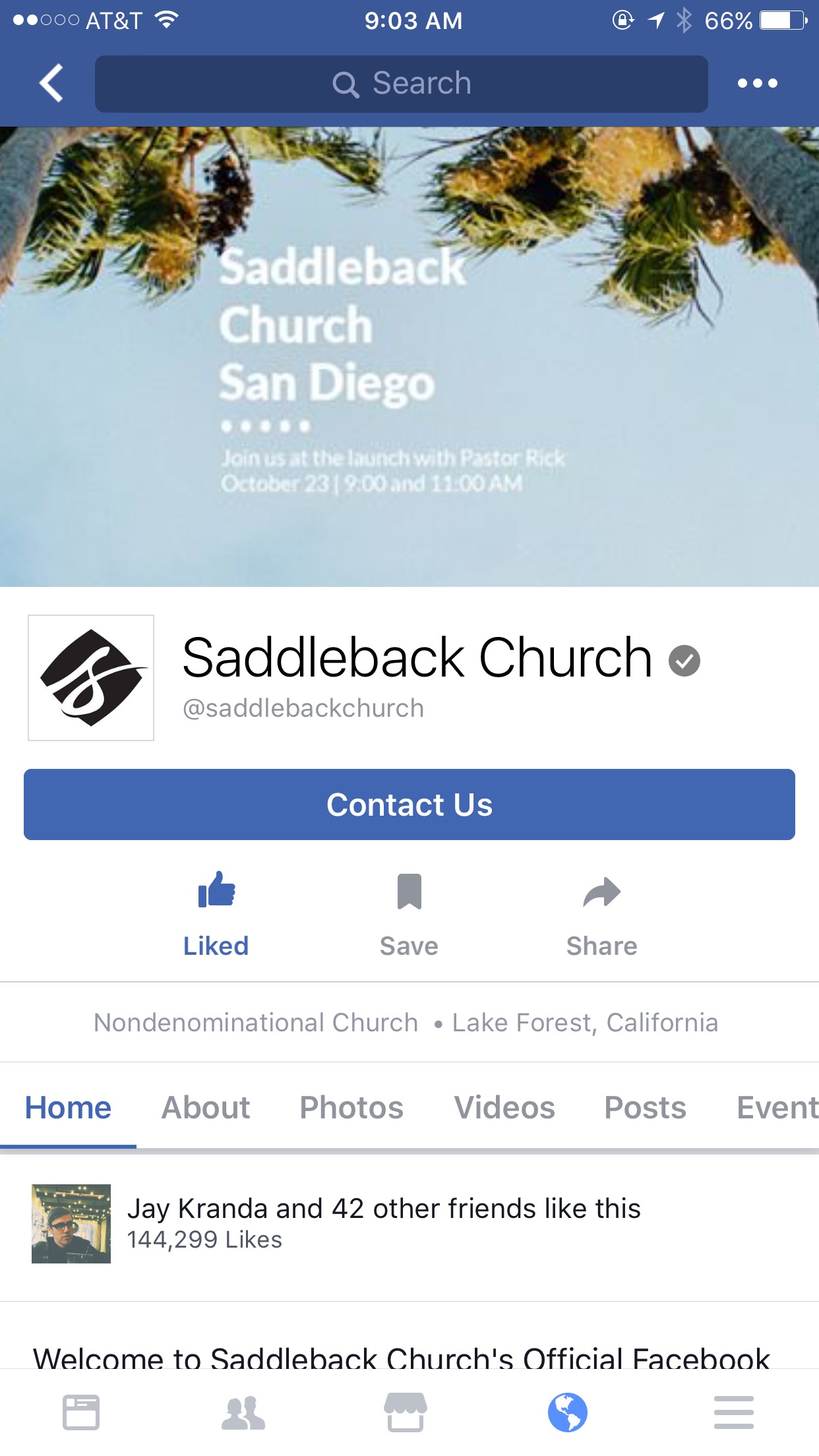
Saddleback is using their prime real estate to promote the launch of their latest campus location in San Diego California.
Their cover image includes details like the date and time and mention that Pastor Rick Warren will be at the opening weekend.
So: (a) If you are in the San Diego area this is immediately relevant to you – or (b) if you go to any of the other SoCal locations, chances are you probably know somebody in the San Diego area that you can share this news with. (c) if you are part of the Saddleback community far from San Diego, this still makes sense because it shows the mission being accomplished by planting yet another location to reach more people – and it conveys that you are a part of that.
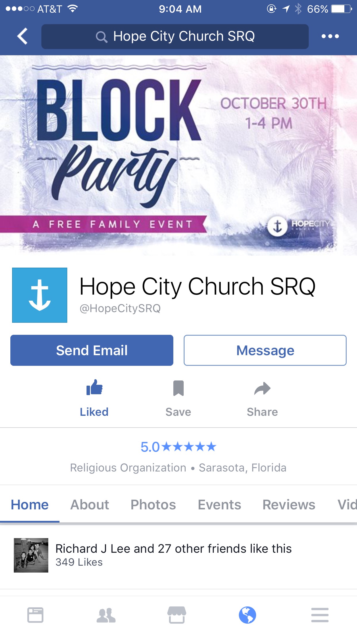
Here’s another one from Hope City Church in Sarasota, Florida that clearly promotes an open event for anyone in the area.
See how this messaging is appropriate for anyone insider or outsider? It’s saying, hey there, this is something we have “for you.”
As you can see, there are a couple of options you can pursue when selecting what image to use as the banner that flies over your church in the digital universe so to speak.
While it might seem trivial to you, I’m going to bet that the choice and cover image impacts bounce rate for new visitors. Remember you audience that are checking out your church Facebook page for the first time. How would receive the message?
WHAT ARE YOU USING FOR YOUR FACEBOOK TIMELINE COVER IMAGE AND WHY?


