This year, I’m helping a non-profit dip their toe into the waters with online donor development activities and A/B Testing is part of it. One of the first things we are doing is to build out a tripwire test campaign. Basically it is an easy initial ask that precedes the main campaign by asking for a low-dollar, relatively easy, painless ask.
There’s two objectives here:
- Attract early donors to help build our list while we prepare for the main end of year holiday fundraising campaign. This allows us to build a relationship and cultivate an affinity for the organization and cause. We will also able to give them the opportunity to have a greater impact later by participating in our main #GivingTuesday and End of Year Holiday Campaigns.
- Test our traffic acquisition targeting (both earned media and paid traffic) as well as messaging.
TESTING TO OPTIMIZE CONVERSIONS
I’m a firm believer that if you have the time and capacity to test, you need to test, test, test. The #1 objective from a donor communications standpoint is to define a conversion point and optimize it so that you can consistently convert leads and prospects into donors.
WHY A/B TESTING MATTERS
A lot of people shrug off A/B testing because to be frank, it is a huge hassle. It takes patience, diligence, and you need to be detail-oriented, organized and analytical.
BUT, the upside is when you make some small tweaks to a page and run it through A/B testing, you can get results like this below. Take a look and tell me that there isn’t anything actionable from these results?

A difference between a 2.1% conversion rate and a 6.4% conversion rate means that you’re almost tripling your success rate. That means while Variation B might pull in $100, Variation A would be pulling in $300. Think about the difference in donations received as you scale traffic to those basically similar pages except some small differences in messaging, headline or button copy?
Are you a fan of A/B testing yet?
CHANGE SPECIFIC ELEMENTS FOR A/B TEST
So let me share a live example with one of our landing pages. For this page, we’re A/B testing the copy above the fold – the Headline and Sub-head.
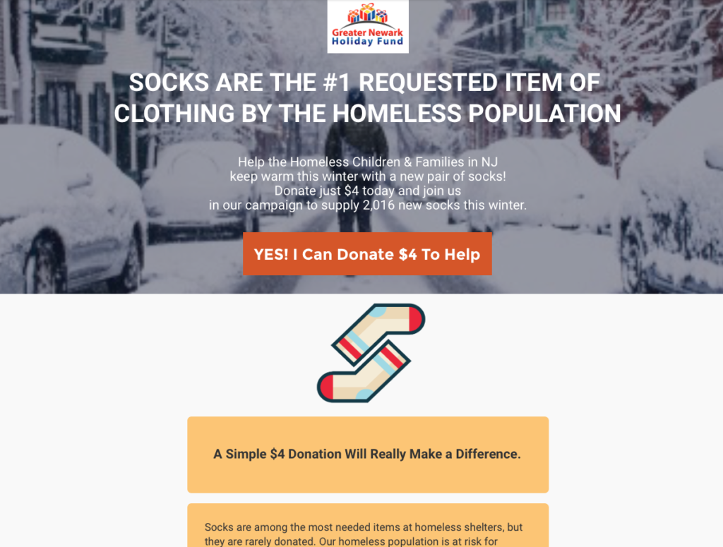
Our baseline offer page for one of our tripwire campaigns features a call to action to donate just $4 to help supply socks to the homeless in NJ. We want to raise enough funds to buy and supply 2,016 new warm socks this winter.
BASELINE DONATION LANDING PAGE

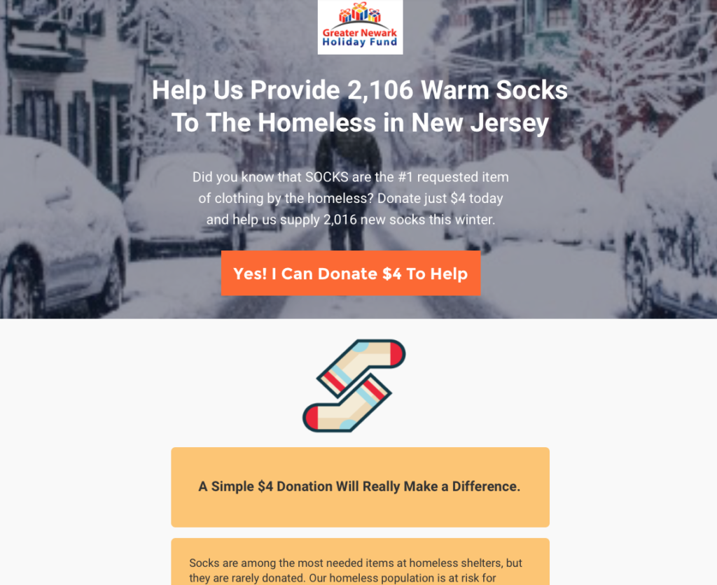
A/B TESTING CHALLENGER LANDING PAGE
In the “challenger” landing page version, we changed the focus of the headline from an educational one to a more campaign/ goal-oriented message. We moved the educational factoid to the sub-head.

Now, we sit back and wait. We’ll throw traffic at both pages on a 50%-50% split basis until we have enough traffic and conversions to make some decisions.
In a couple of days, I’ll circle back and share the results.


