Website strategy. Everyone has one, right?
Building a website is like printing your business card in today’s times. People don’t take you seriously if you don’t have one. You don’t legitimately exist if there’s no website.
And that is the start of the problem.
So many organizations today build websites without thinking about WHY they have one. But rather just to have one because everyone else does.
The marketing communications teams that really think through strategic reasoning before they actually tackle the building of a website are the ones that win in the end.
Strategic intent needs to extend to the nitty-gritty level. Without that you'll miss the mark Share on X
And by winning, I mean:
Websites can help visitor interactions meet strategic business objectives in a big way. But most orgs ignore this opportunity completely.
The devil is in the details as they say. What do I mean by that?
YOUR WEBSITE STRATEGY NEEDS TO BE TRANSLATED INTO EVERYTHING YOU DESIGN
Here’s a great example: One of the key pieces of real estate a new visitor is exposed to when they first see your site is the menu bar. The words you choose to use for the navigation options presented can make a big difference. It can tangible make a different in the percentage of people that actually follow through beyond the homepage and engage with your site’s content.
When our team built the redeemer.com for Redeemer Presbyterian Church, we took a hard look at the navigation choices we wanted to present.

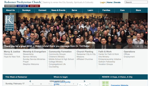
The first overhaul was to cull down the choices from dozens and dozens of navigation links on the old home page to just a simplified set on the new one. If you were part of the Redeemer Presbyterian Church community for awhile, you’ll remember the old site with lists and lists of links on the home page.
A common mistake = present too many choices & offer paralysis by analysis! Share on XTHE KEY PERSPECTIVE TO A SUCCESSFUL WEBSITE STRATEGY
One of the most subtle but distinctive things that we did employ was a radical focus on the visitors persona and needs.
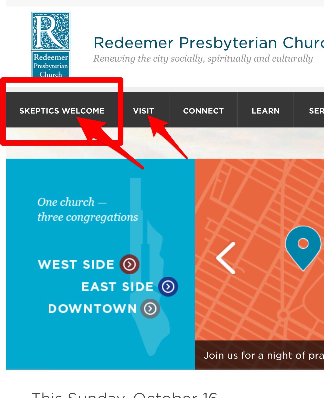
That let us define the 1st/most prominent navigation menu option with the copy: “SKEPTICS WELCOME”
For the non-church-going New York City resident, this is the phrase that we believed was the most compelling one to invite them to click further into the site.
Most other churches I know would shudder at the scenario of putting such an open-ended and potentially troublesome conversation trigger on their homepage.
You will see that the second menu option was simple, and direct to the point: “VISIT.” That is because if we passed the bar in interesting you as a visitor in the first glance of the site, the next action step we want you to take is to actually plan to visit one of the services at multiple locations across the city.
Both top priority navigation choices are completely written from the visitor’s point of view.
It is a good approach to take across all of your marketing collateral. Do you have any examples of putting the target audiences interest radically ahead of traditional “in-house” interests?
If you can't answer the WIIFM (What's In It For Me) from the visitor's POV, you're in trouble Share on XI would love to hear of bold and daring examples that you have been able to put into place in your messaging.
Please leave a comment below and share a strategic website #win with me and the other readers here.


